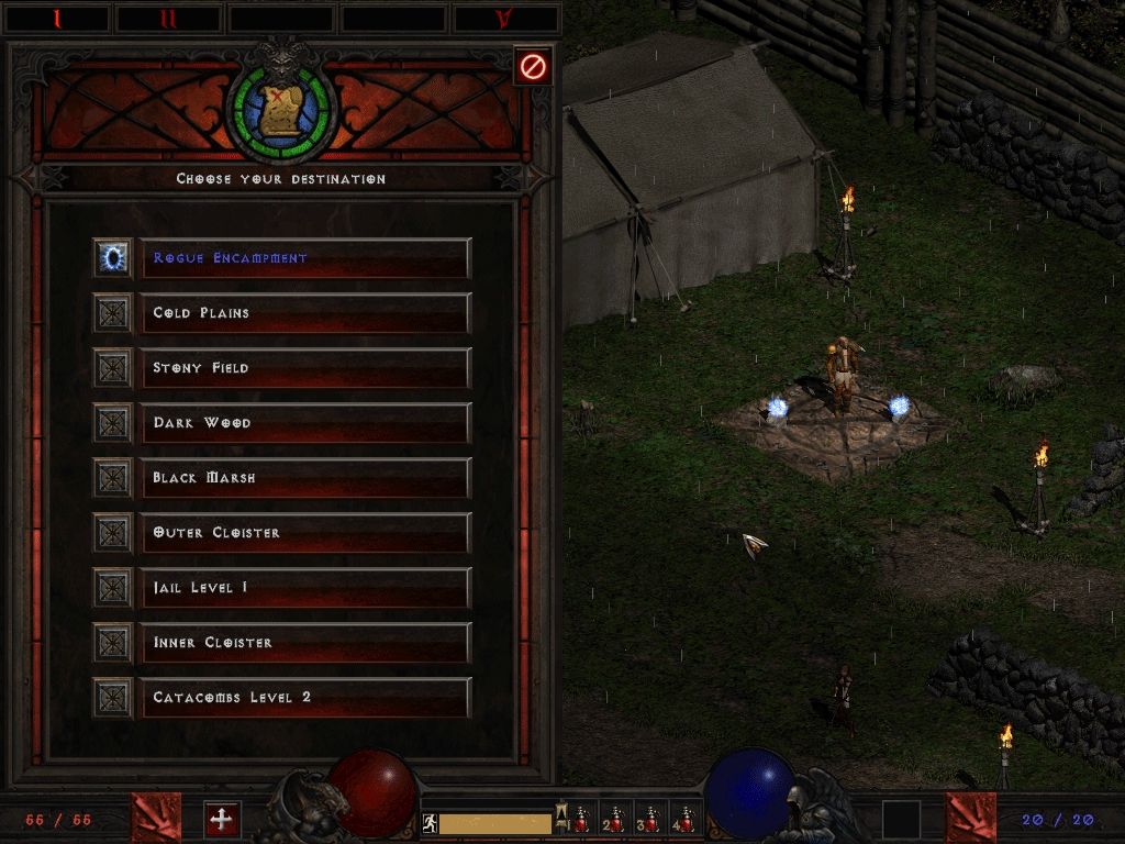
Here is the Waypoints.
Moderator: Nefarius


Thankskidpaddle94" wrote:Wow, again, fantastic work. I like it!

Lurix" wrote:Seriously dude, you got the best GUI I've ever seen in this forum, and can't wait to try this out.
Thanks guys.k0r3l1k" wrote:dammit man. Yours looks better than mine. :/ guess i need to get back to work :'(


Thanks for the feedback. But,Demon9ne" wrote:Black_Eternity:
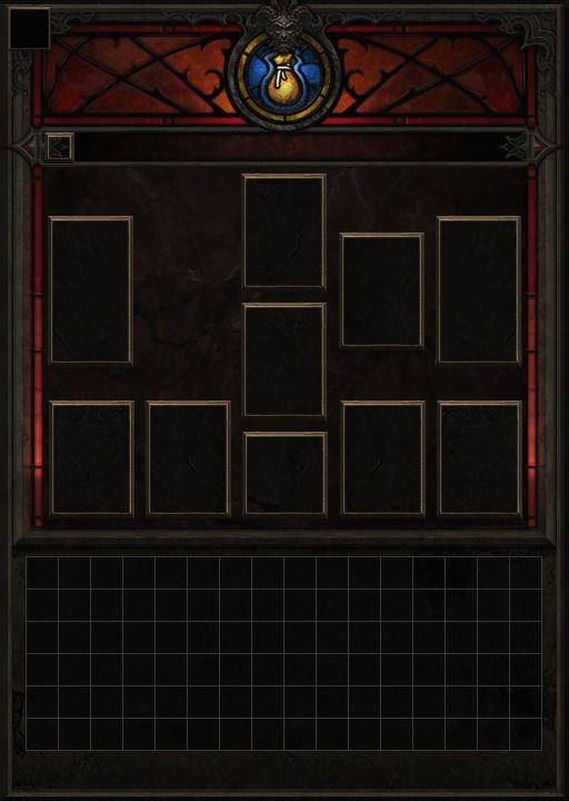
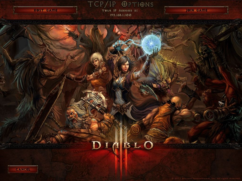
Your screens are great.
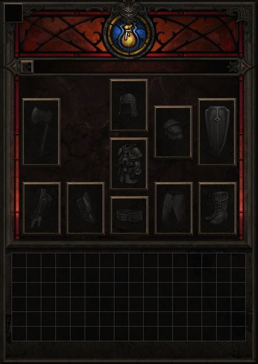
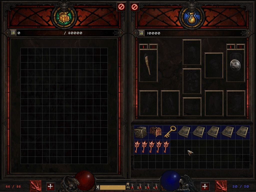
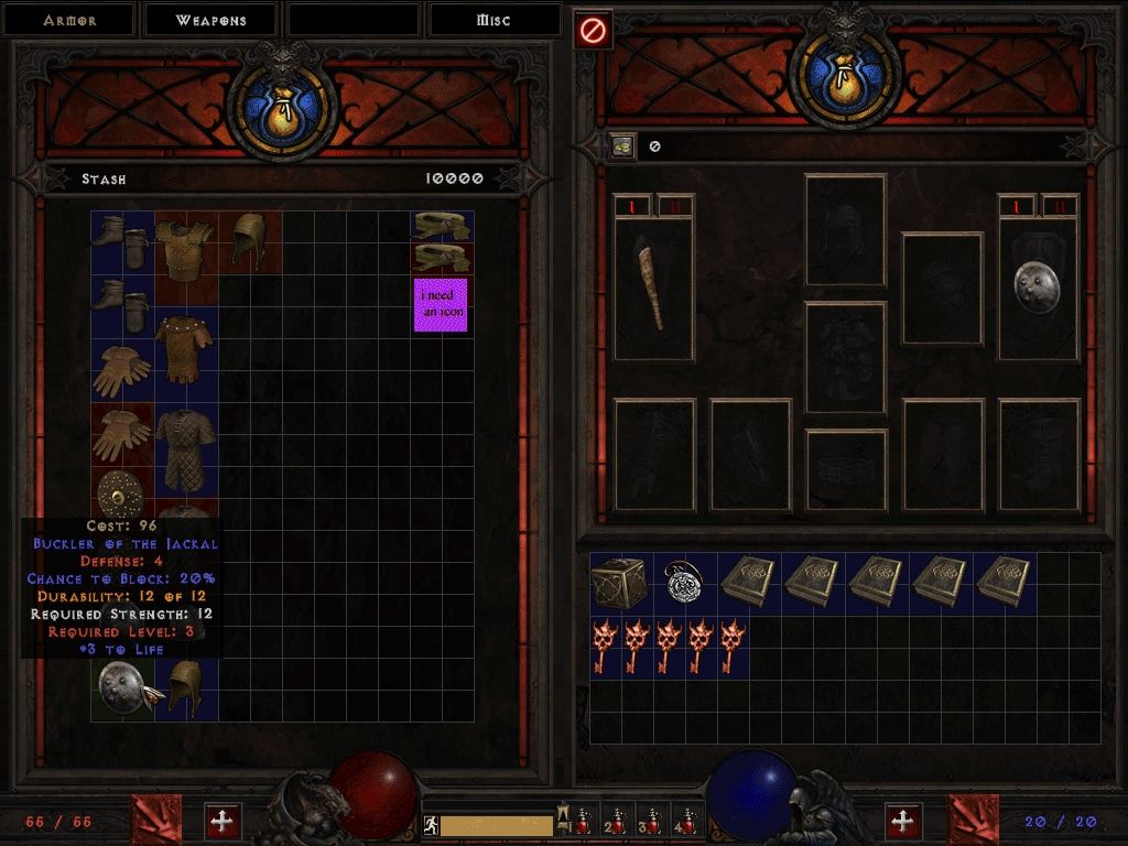
The placement icons look good, but maybe drop the opacity on them.
Two other things to consider--
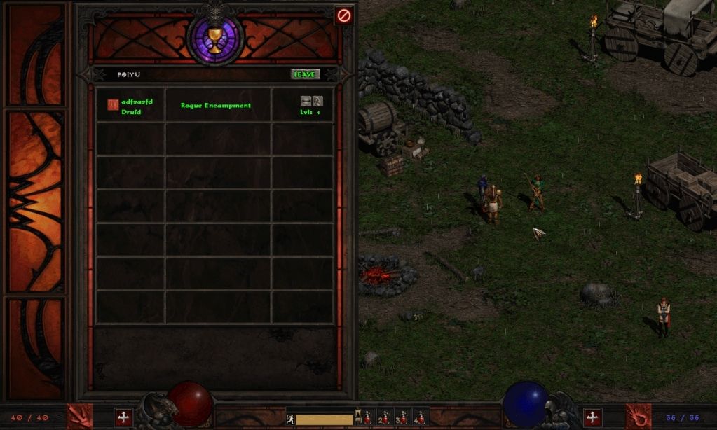
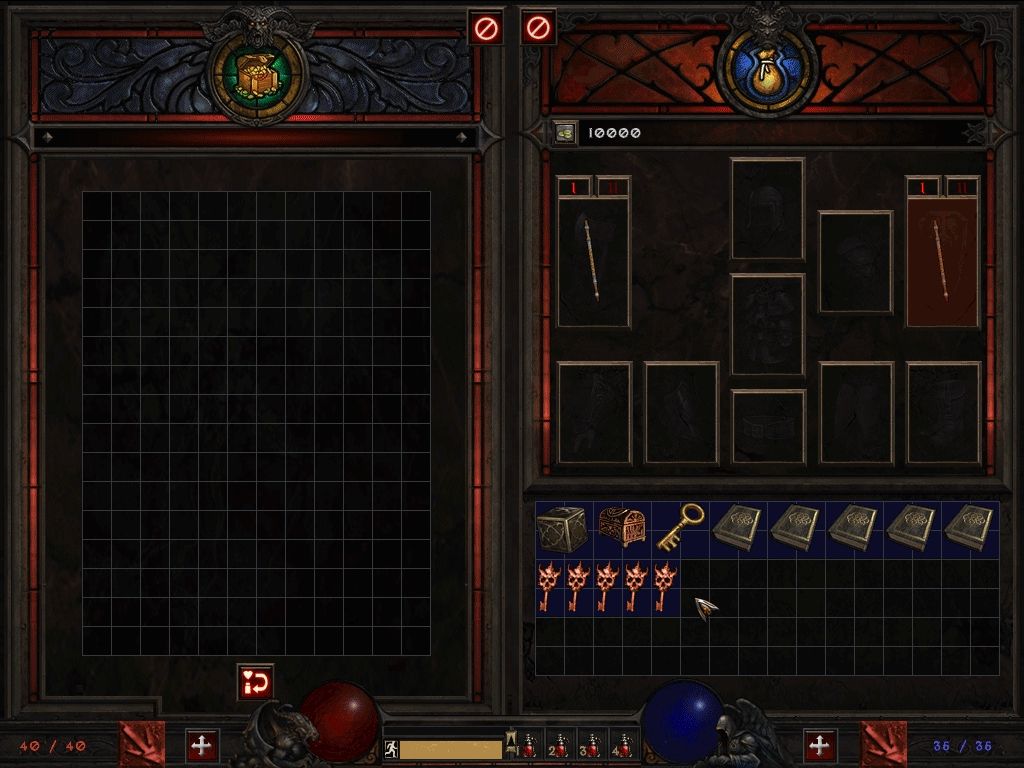
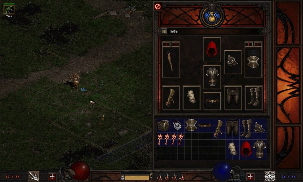
- If you're doing a D3-esque mod, your items will all be 1x1 slot and you won't need that much grid space below.
- If you're keeping D2 charms, they'll be hell to balance with an inventory grid of that size.


Thankskidpaddle94" wrote:Great work, on all of them xd
I like the repair idea also.


Each class will obtain special attributes that will allow critical hits to be more effective.
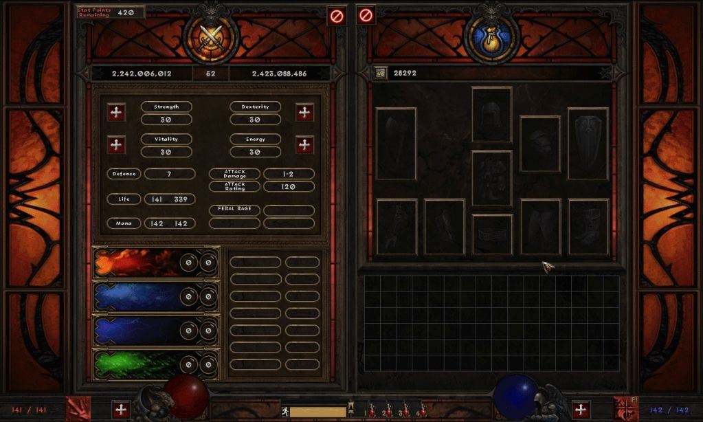
Ahh yes, after playing the beta last weekend, armors is now 1x2kingpin" wrote:For information to post before d3 is no longer 1x1 slots demon


11/1/08 - COTL; 5/10/09 - Angel; 11/11/09 - ArchangelAlthough done for our needs, mod-makers should like these changes, too.


